When researching enormous amounts of navigational data creating a hierarchical graph of the data can be very insightful. One of our long-term customers has a very content rich website which keeps growing over the years. Back in the days we have build a custom solution which is basically a set of tools via which the website is created.
Navigation and content are both maintained in a large Excel sheet, both the sheet and files are uploaded and the server converts this pool of information into a website including all navigation.
Although currently we are using the fourth revision of the site the workflow is still the same as back in early 2000. The latest revision of the site always had some navigational issues. Depending on the section and depth the menu’s would become too long or even wrongly placed.
Over the time the templates which drive this have become filled with exceptions and hardcoded conditions. When recently a new section was added to the site the issues of “funny” or “plain wrong” navigation raised their ugly bits again.
Instead of digging into the templating code I decided to try something else; get the insight of WHEN en WHY this happens..
We have been adding the Neo4J Graph database to our new toolkit and I learned to appreciate the visual representation of the data, it shows you how stuff is related and it creates an insight which is missing when you are browsing through lists of lists and folders of folders.
Instead of converting everything into a graph database I decided to try and use some Graphing tools I’ve learned through meetups about graphs.
First in line was Gephi which might be very suitable for the job but sadly does not run on Mac OS X at the moment due to several issues. Instead of trying to mold my Java installation I had a quick look via a Windows VM. It is most certainly a package I will try again when 0.9 is back up to sniff and runs on Yosemite.
An important part of the Excel sheet in which all assets are documented is the “location” of the asset in the site; there are more than 1800 lines which look like:
Nieuws > Politiek? Het interesseert u geen ene moer
Nieuws > Publicatie 'De veranderende relatie tussen burger en overheid'
Feiten en cijfers > Amsterdam > Kerncijfers
Feiten en cijfers > Amsterdam > Bevolking
Feiten en cijfers > Amsterdam > Openbare orde en veiligheid
Feiten en cijfers > Amsterdam > Werk en inkomen
Publicaties > Amsterdam in cijfers
Publicaties > Amsterdam in cijfers > 2014
Publicaties > Amsterdam in cijfers > 2013
Publicaties > Amsterdam in cijfers > 2010-2012
Thema's > Verkiezingen > Tweede Kamer
Thema's > Verkiezingen > Tweede Kamer > 2002
Thema's > Verkiezingen > Tweede Kamer > 2003
Thema's > Verkiezingen > Tweede Kamer > 2006
Thema's > Verkiezingen > Tweede Kamer > 2010
Thema's > Verkiezingen > Tweede Kamer > 2012
Thema's > Verkiezingen > Provinciale Staten
This can easily be converted to a format which is known as “the dot language” which is used by several tools including Graphviz. With some quick Python code applied:
for i in open("items.txt"):
i = i.strip()
e = [ '"%s"' % x.strip() for x in i.split(">")]
print " -> ".join(e)
there was a basic DOT file. And with a bit more fiddling there was an image:

Not too useful but it is a start. From one of the Graph meetups I remembered there was another package. After some note-digging I remembered its name; Cytoscape. The installation went quite a bit smoother than Gephi but short after the installation there was a new challenge. Where Gephi and Graphviz both support the DOT format Cytoscape does not. Luckily there are converters.
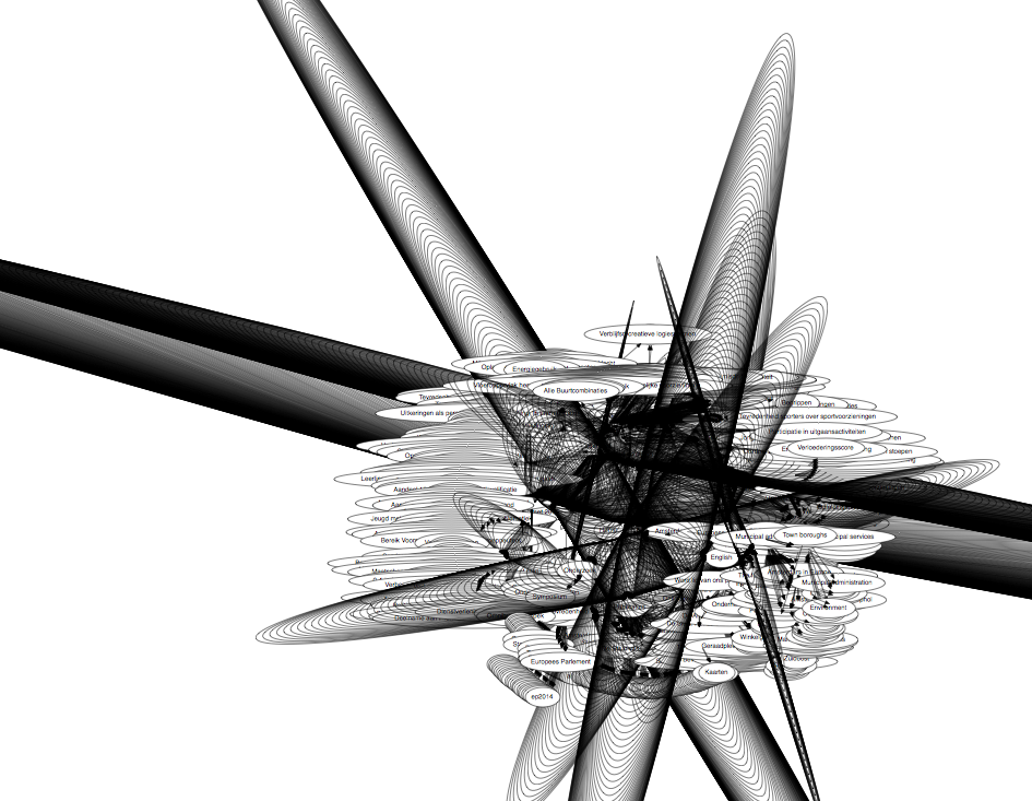
After converting and loading I saw the results and realised that getting something useful might be more difficult than I wanted it to be.
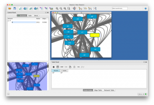
Obviously Cytoscape should be capable of getting this right but it’s defaults are not geared towards my use. Getting to know Cytoscape was not the goal of this excercise, I wanted insight into the structure of the information of this particular dataset.
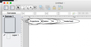
The simple Graphviz client seemed more capable in viewing what I needed than the fancy tools. But layout was far too wide and not very useable to get an overview. While googling on how to make nicer layouts with Graphviz I skimmed some message about Omnigraffle and its capabilities of reading a DOT file. I had it even installed on my machine as I used to use Omnigraffle quite a bit for network drawings in the past.
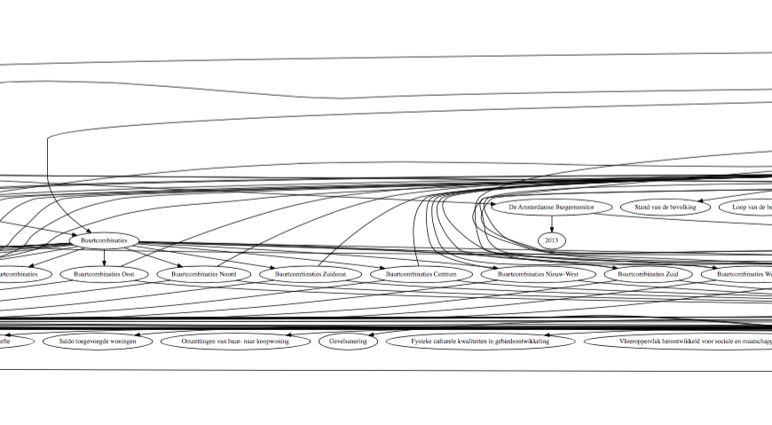
When loaded everything looks a mess;
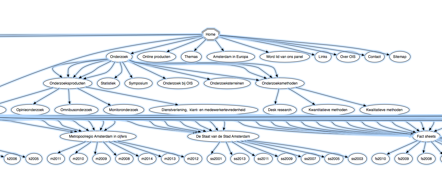
but as soon as you click on the “automatic layout” all the magic happens:
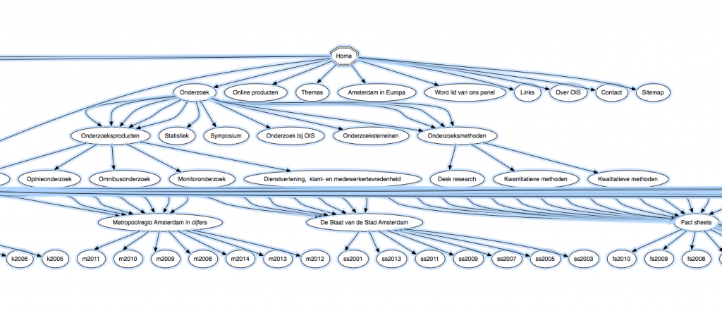
As it turns out once you load the full dataset it becomes quite arty 🙂


By viewing the graphs two things where found, one is the source of the problem, the templates always assume a depth of three levels but sometimes a depth of four is required. Some fixes we did in the past are solving some of the issues but as these are hardcoded these don’t work for new sets of data.
Another thing which became apparent by looking at the graph, and once you see it its bloody obvious and we should have realised it years ago, is that quite some stuff is related to specific years. The zoomed in version show various end nodes labeled by year. We prefixed them here to avoid interconnections between the nodes but the site can actually benefit from these interconnections. Navigation by “related by year” is completely possible by using this, already available and automatically generated, meta information.
But first we will be fixing the navigation mess…